I led a UX initiative to address user feedback about GovQA's excessively bright interface by designing and implementing configurable color themes in the Material 3 framework, ultimately creating three options—the updated original theme, a soft light mode, and a deep navy dark mode—allowing users to customize their experience based on personal preference and accessibility needs.
I led a UX initiative to address user feedback about GovQA's excessively bright interface by designing and implementing configurable color themes in the Material 3 framework, ultimately creating three options—the updated original theme, a soft light mode, and a deep navy dark mode—allowing users to customize their experience based on personal preference and accessibility needs.
Lead UX Designer
2 months (March 2023 - April 2023)
Figma, Miro, Pendo
Research findings, grayscale wireframing, hi-fi mockups, design specifications
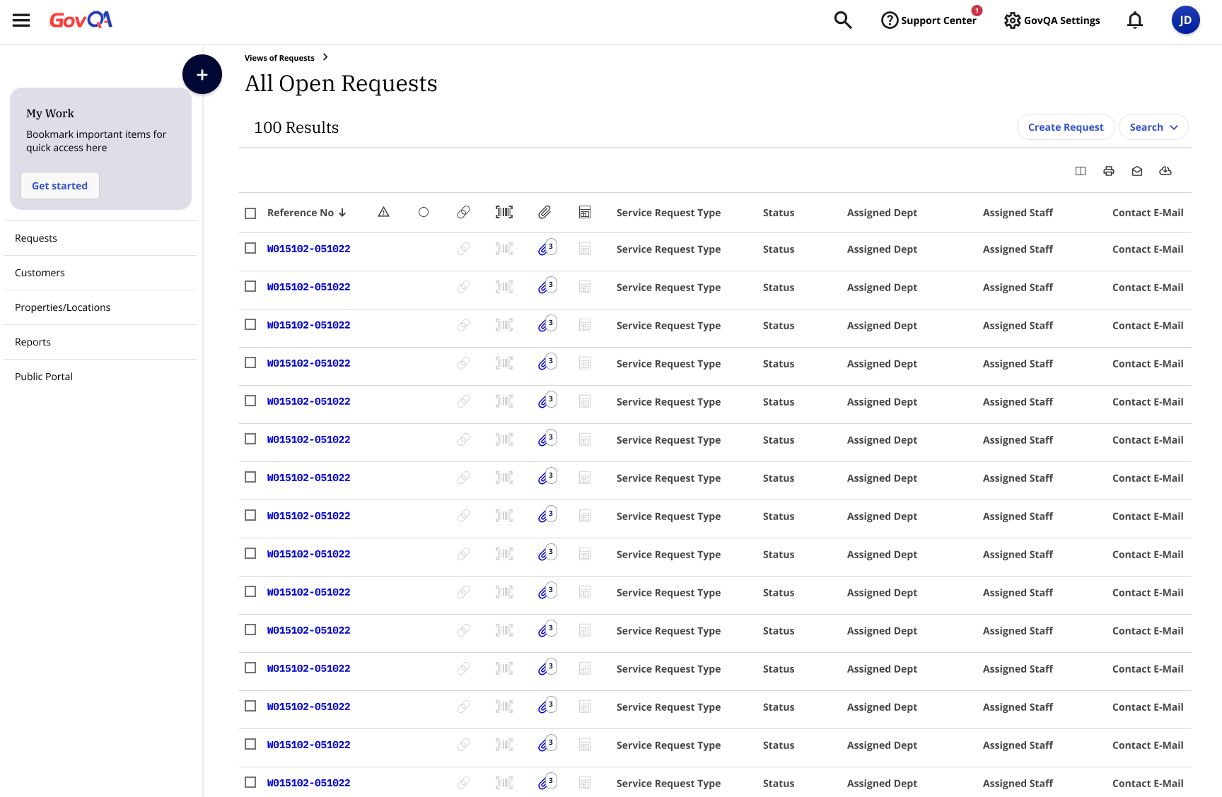
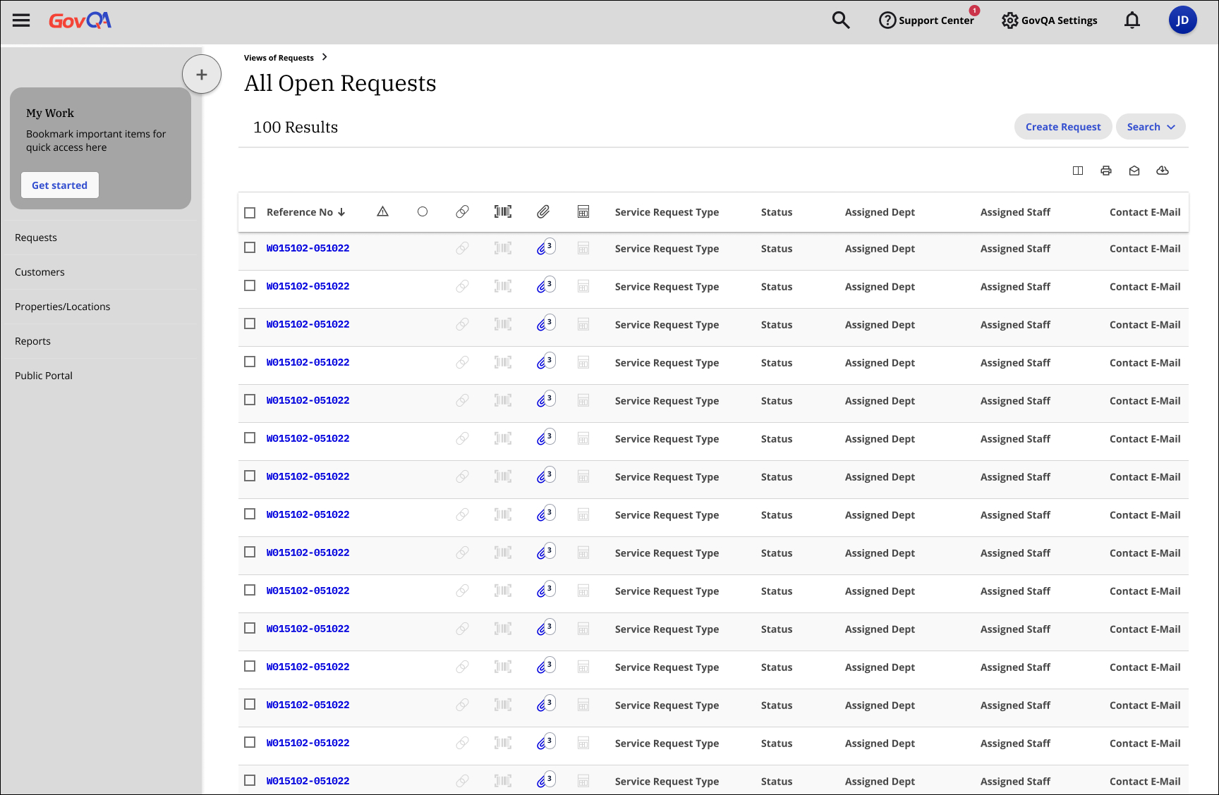
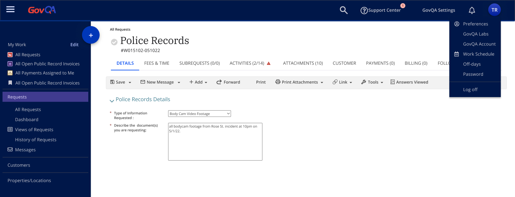
GovQA's product interface was consistently described by users as "too white and bright," causing visual discomfort during extended use. As the product underwent a framework rebuild, there was an opportunity to address this user pain point by implementing color themes within the Material 3 framework, but the challenge required balancing immediate improvements with technical constraints while ensuring accessibility and user satisfaction.
Determining which parts of the product could adopt new color themes immediately versus which parts needed to wait for the framework updates
Creating a logical approach for applying themes to specific UI elements that would provide meaningful improvement while the product was in transition
Challenging assumptions about what users actually wanted (dark mode vs. low-contrast light mode) through targeted research
Ensuring all proposed themes maintained readability while addressing the brightness concerns
Adapting the new color themes to work within the existing design system framework while leveraging Material 3 color theming principles
In the initial ideation phase, I employed grayscale component mapping to strategically identify where color themes would have the most impact while working within the technical constraints of GovQA's partial framework migration. This approach allowed me to focus on structural decisions before committing to specific color palettes, initially hypothesizing that users wanted lower contrast colors rather than darkness.
After initial ideation revealed conflicting assumptions about user preferences for color themes, I conducted targeted user research to validate which approach would best address the "too bright" feedback while maintaining usability and accessibility.
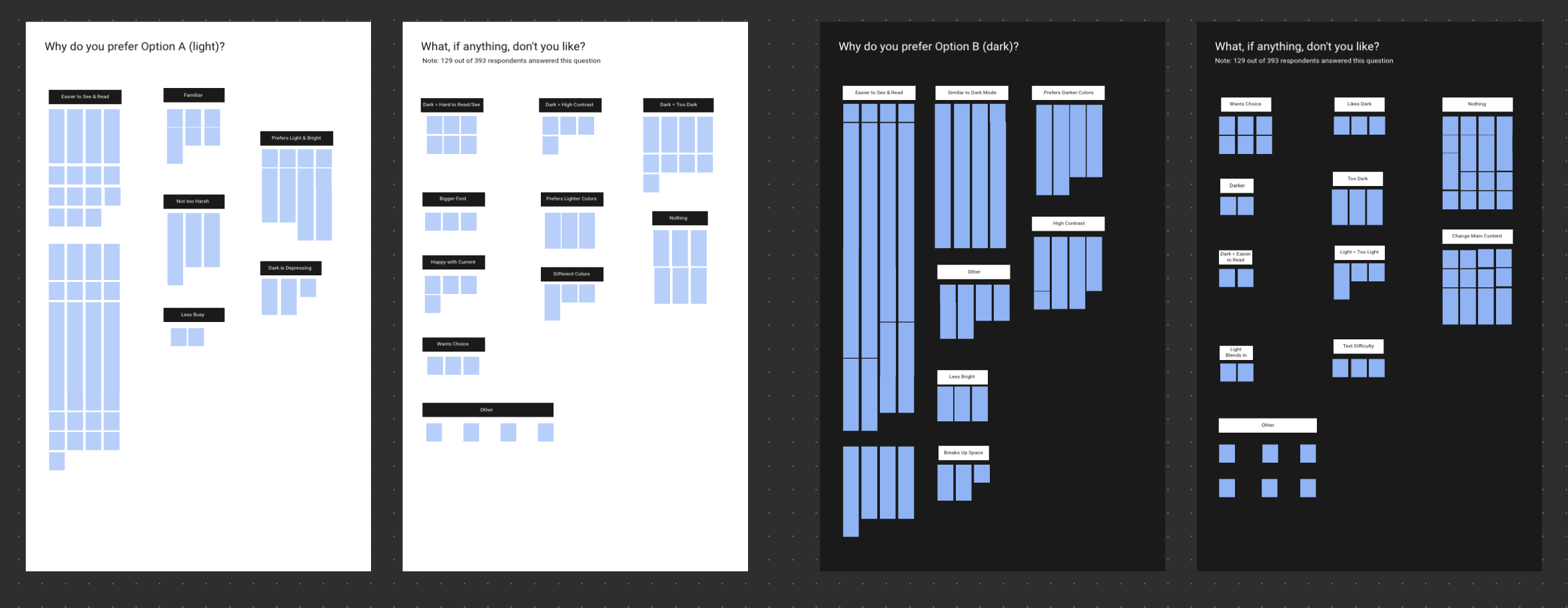
User preference was nearly evenly divided between dark and light themes
Users reported opposite experiences with readability across both options
Dark mode was preferred for longer sessions to reduce eye strain
Some users found the dark theme "depressing" while others found it soothing
Users expressed different preferences based on work environment and individual needs
The research revealed that no single solution would satisfy all users, leading directly to our decision to implement configurable themes that give users control over their experience. This user-centered approach transformed a potential design impasse into an opportunity to enhance personalization and accessibility.
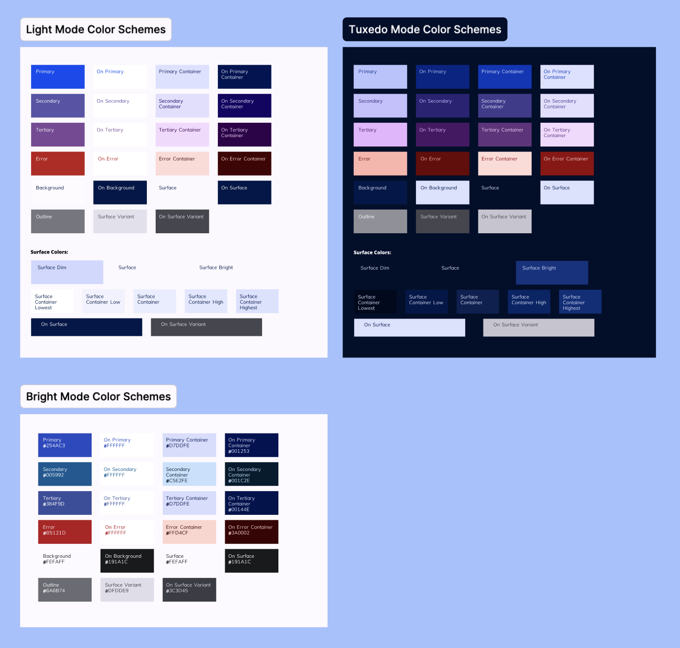
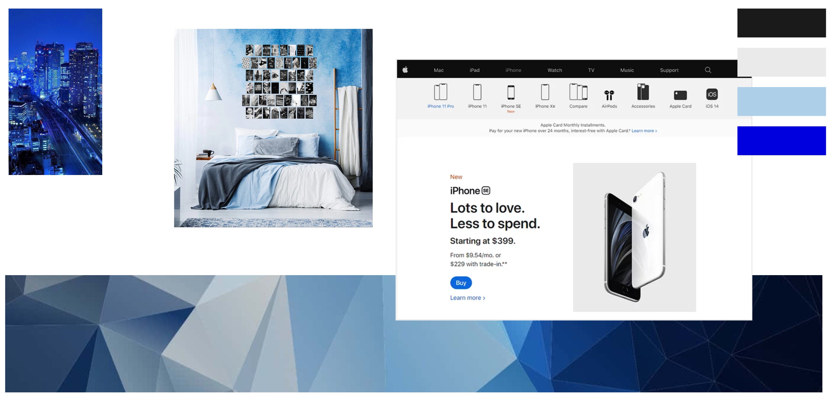
Following the research findings, I developed a multi-themed approach that would accommodate our diverse user preferences while working within technical constraints. I created moodboards to explore color palettes that would both resolve the brightness issue and integrate well with the existing framework's colors on pages that couldn't yet be updated. This thoughtful integration was crucial to ensure visual consistency across the product during its transition period.
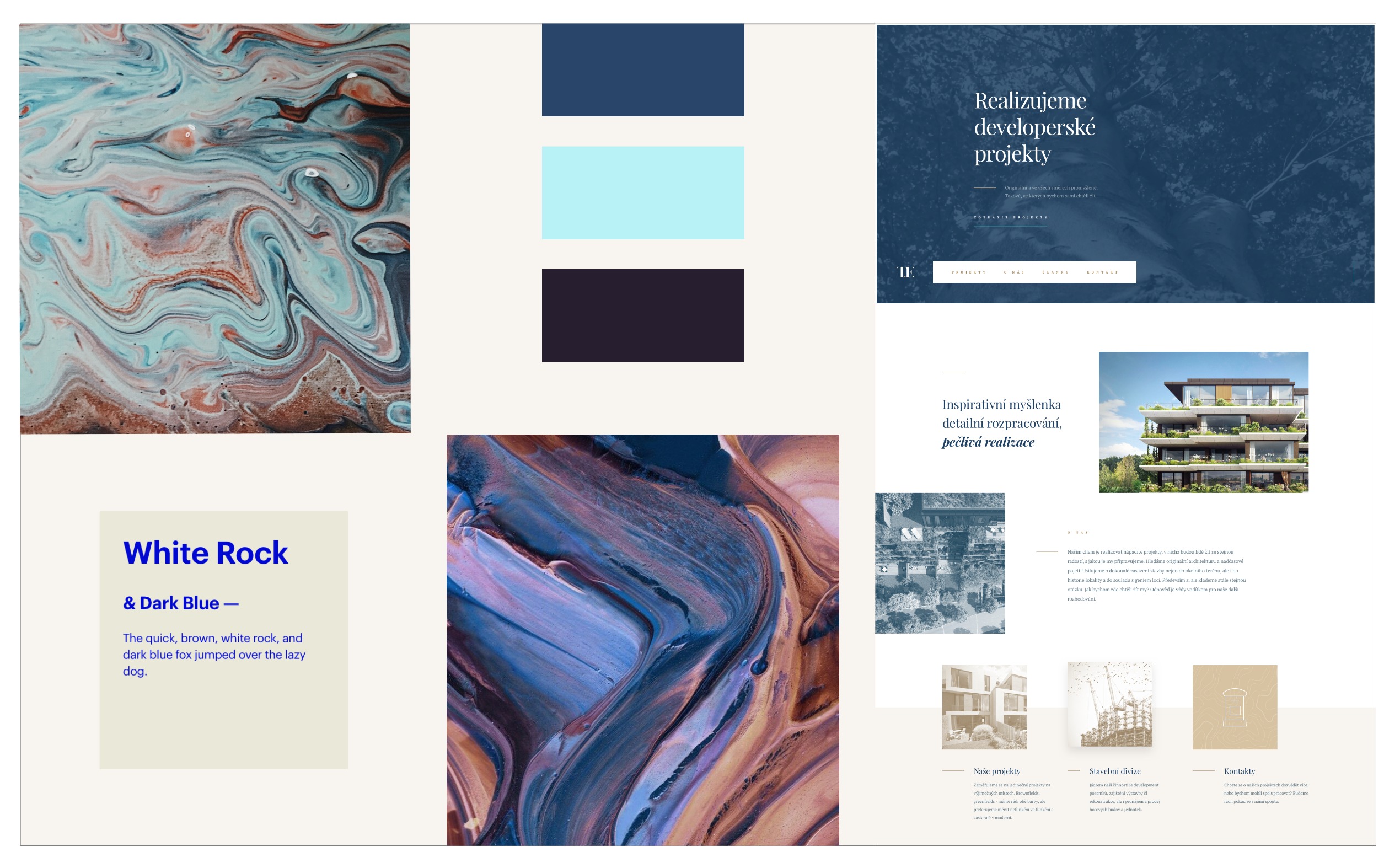
Working with Material 3's color theming capabilities, I refined three distinct themes: an updated version of the original design system colors, a soft light theme with reduced contrast, and a deep navy dark theme. Each palette was carefully evaluated for accessibility standards and tested within the interface to ensure it maintained readability while addressing the brightness concerns raised by users.
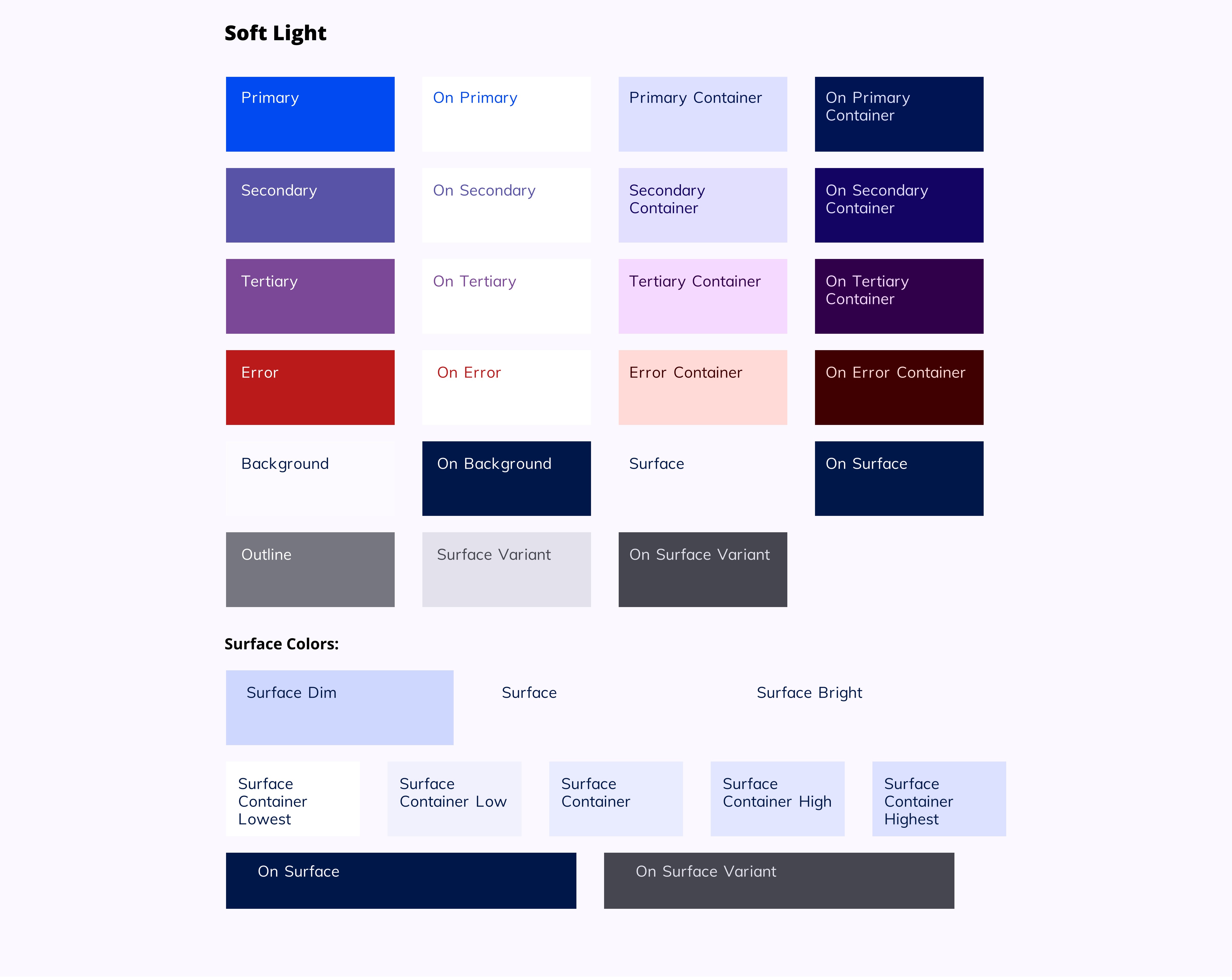
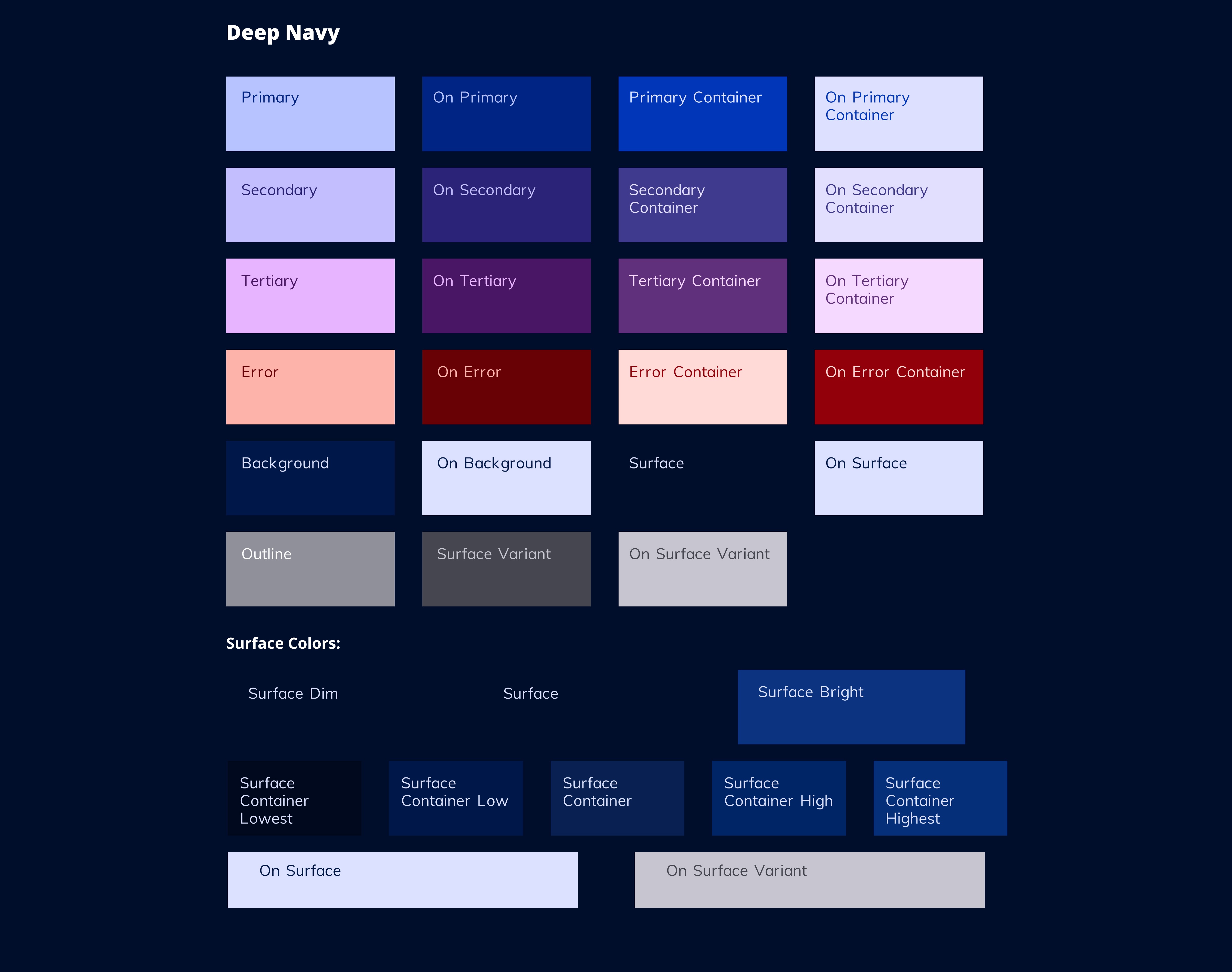
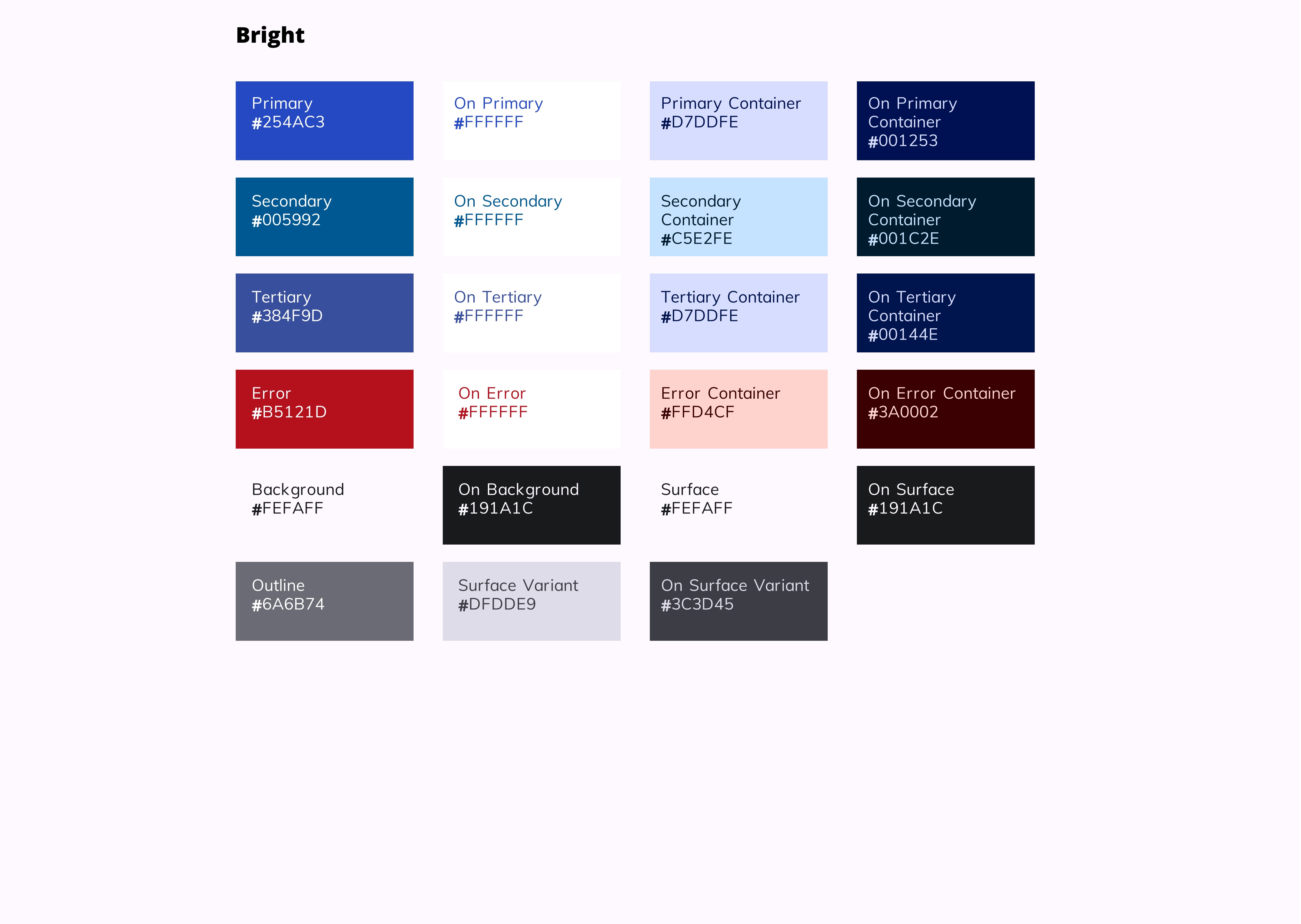
We implemented three configurable color themes—updated original, "Soft Light," and "Deep Navy"—that strategically applied to key interface elements while maintaining compatibility with legacy sections, successfully addressing brightness concerns with high user adoption rates.
The GovQA color theming project successfully balanced diverse user needs with technical constraints, resulting in a configurable solution that addressed brightness concerns while maintaining visual cohesion across the evolving product.
Navigating a partially updated codebase required strategic decisions about where themes could be applied
Initial design direction based on untested assumptions needed recalibration after research
Creating themes that addressed brightness concerns while maintaining readability and accessibility standards
Ensuring new themes harmonized with legacy sections that couldn't yet be updated
User research prevented potentially costly design decisions based on incorrect assumptions
Starting with grayscale mapping provided clarity on structural impact before color selection
User preferences are rarely uniform, and flexibility can create a better solutions
Thoughtful implementation planning allowed for meaningful improvements despite technical limitations
Continue building the remaining product components using the new themes
Gather focused feedback on the implemented themes to guide refinements
Further optimize each theme for specific accessibility needs